UX / UI / IDEA
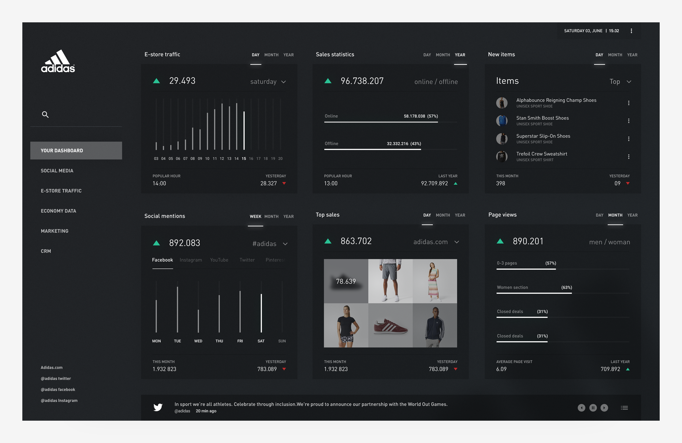
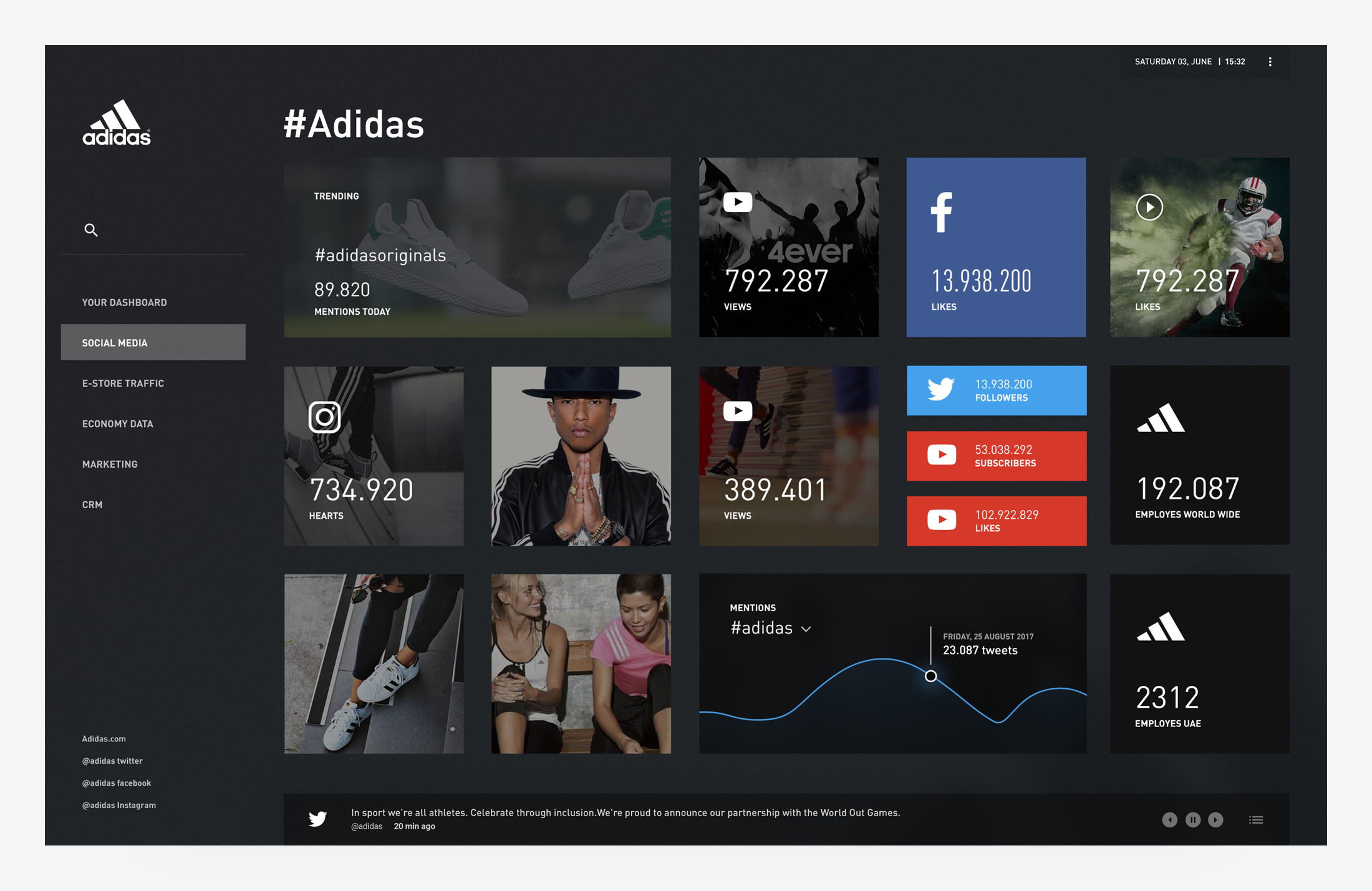
Our brief includes a rough/high-level sketch of a wireframe, providing a starting point for your work. However, beyond that, you have complete freedom to further develop it. When creating the final output, data visualization will be crucial. It should be clean, clear, and attractive. You have the flexibility to decide how to visualize the information, whether through graphs depicting time or bars, among other options. Additionally, consider the dashboard as something that feels personalized and engaging, rather than just a collection of floating data.
Note from the Project Manager: "We presented it last week, and they absolutely loved it!"